You may have noticed this website doesn't look like it used to. That's because I've spent the past week redesigning it from scratch. Everything has changed, from the stack to the design style, and I thought it'd be a good idea to write about what motivated me to put in the work, what inspired the design, and what I learned in the process.
The Why

I felt like the old design didn't convey the image I wanted it to. Granted, it looked great, but I'd say the design was better suited for a magazine than for a personal indie website. It also puts too much focus on the articles, while the new one puts focus on who am I and relegates the articles to a sub-page. This new design makes this look less like a professional blog and more like my small fun corner of the internet.
Besides that, there were some issues with my old stack. I was using a static site generator that only worked half of the time, the CSS was a mess and dark mode didn't look great with most of the elements of the page. Another of the things that motivated the change was having a website I could be proud of. Not just proud of my content, but everything.
The How
I decided to drop the static part of my website and switch back to a CMS. I love Ghost, so I set off to create a custom theme from scratch. Using Tailwind CSS made everything a lot easier and saved me from falling into the messy CSS problem again.
I started with the home page, which originally included links to recent articles. I ended up with a minimalistic vibe I really liked (inspired by Justin's website minus the brutalist part). I designed everything from the start focusing equally on the light and dark versions (have you noticed the moon button on the bottom right corner?) to avoid facing the same problems I had experienced on the old design.
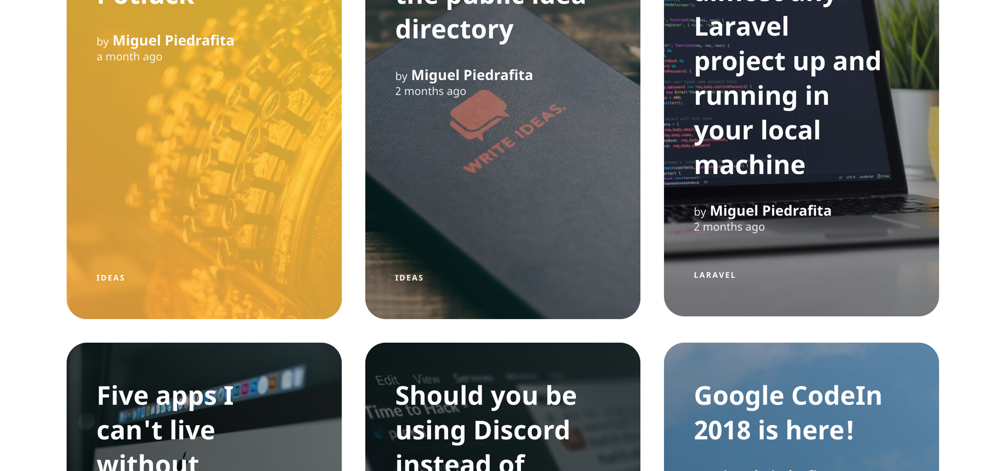
Once that was done I moved to the article page. I really wanted some color in here while keeping the minimal look, so I added the gradient border to the top section (highly inspired by CSS Tricks) and made the cover image a moving blob (here's the code for that in case you're curious). I also integrated the Blogcast player into the design (check out that play button on the gradient border) using the new white-labeled player feature. Finally, I added a card to direct readers to my newsletter at the bottom of every article (more on that below) and a full-blown comment system powered by Commento, a comment system built with privacy in mind (and this time, comments also look awesome on the dark).
I then went on to design other pages, like the articles page, which has some interesting text-based filters or the projects page, inspired by Josh Pigford's project page.
Finally, I designed the newsletter page. If you haven't yet subscribed, I'd recommend you to do it, because I'm planning to focus on that newsletter a lot more from now on, with weekly project updates and early access to articles (you can also support me for more updates and even earlier access).
The Now
I plan to write more this summer and will probably launch a few things before I start school again in September (that'll be my last year before university!). I'll also keep tweaking the design, which I've open-sourced.
Would love to know what you think about the new design, so make sure to leave a comment below (who knows, you could be forever remembered as one of the first commenters of this website!) :D